Klei Works
What we've done:
Naming
Logo Design
Branding
Web design
Web development
Minimalism. Sophisticated tone of voice.
Earthy color-scheme.
These were the pillars of our brand vision. Soon, our studio created an eye-catching brand which clearly focuses on the artistic and timeless value of each pottery product.
This simplicity is reflected in the outline of the website, with large and unimpeded sections where the message and visuals take center stage.
Name & Story
Though it's impossible to rank brand elements according to their importance, we were well-aware that the name had to be the first step, which would then set the tone for the rest of our creative process.
Klei - as a phonetic play on clay as the main building element - immediately stood out as the founder's favorite and immediately inspired the rest of our creative choices. The narrative behind the brand flowed naturally as we placed special emphasis on the celebration of nature, earth and the unique craft of pottery.
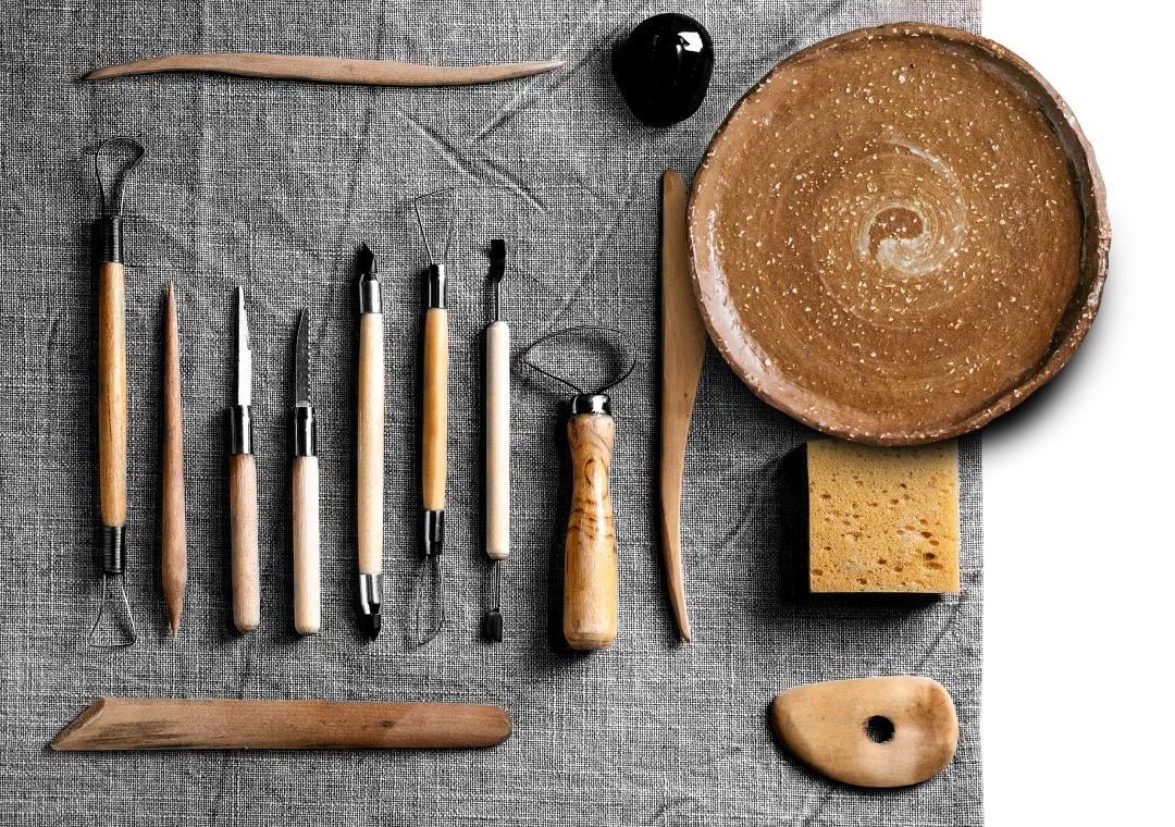
Logo Design & Branding
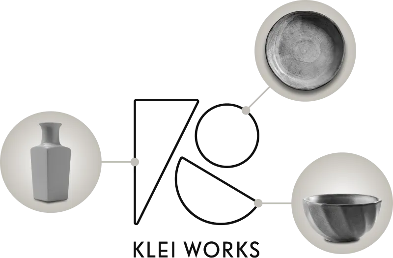
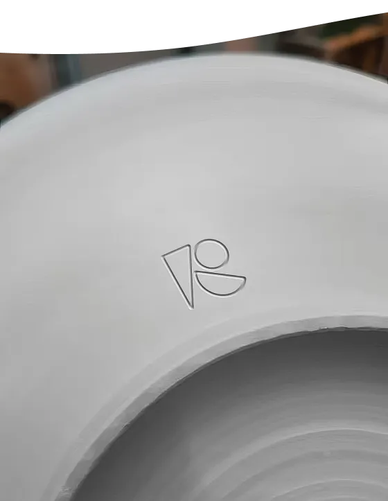
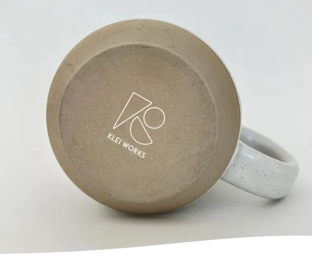
We are incredibly proud of this one! In an optimal scenario, a brand's logo should reflect its essence and, ideally, help users make the right association regarding the brand's services or products. By combining basic geometric shapes, which stand for pottery items, Klei Works has a unique logo which is definitely easily recognizable.


Branding application
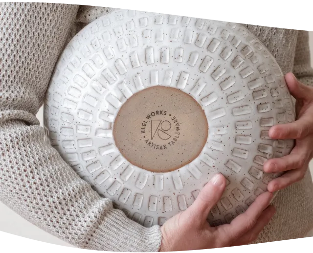
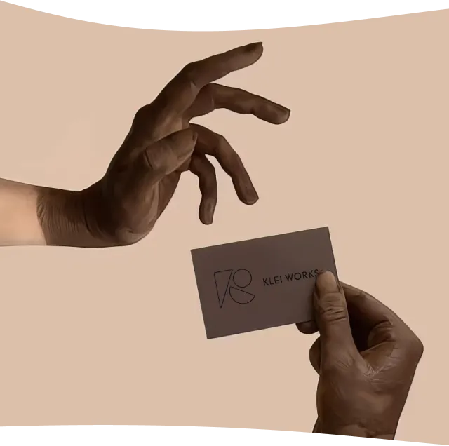
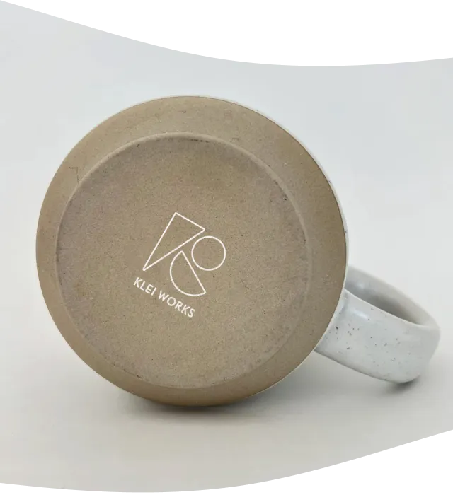
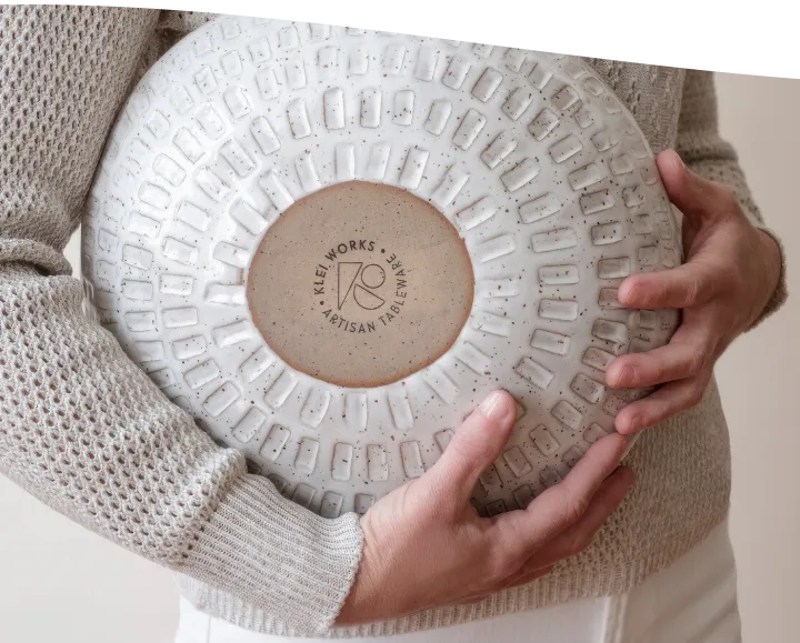
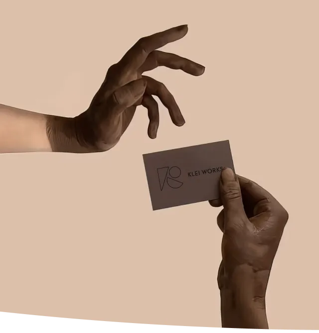
While designing the logo, we made sure to anticipate its use, beyond mere identification. The way we envisioned it, our logo solution offers a diverse use in branding products as an understated, but effective final touch to already invaluable pottery creations.
As shown in the picture above, we offered two different versions of the logo, one of which contains the name and purpose of the brand in writing. This allows for a wider array of applications as the brand grows in the future: merchandise, printed materials and similar.

Web Design
& Development
Digital presence has become an indispensable step in the development of a new brand. Returning to stage 1, we aimed to apply the ideal of minimalism and all things artistic: grainy, even smudged textures, breathtaking visuals of top-tier pottery - everything that is an irreplaceable part of the pottery creation process.
In terms of web development, we ensured that the website was presented in all its glory and uniqueness for all device types. Recognizing the critical importance of an adaptable interface in today's dynamic online ecosystem, our team undertook a comprehensive approach to ensure optimal user experience across various devices. Klei Works is now available for desktop, tablet and mobile.
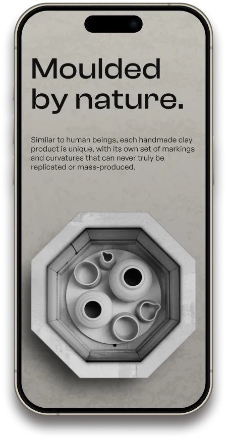
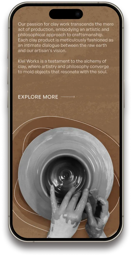

Leveraging cutting-edge design principles and employing a mobile-first strategy, we seamlessly adapted the website's layout, navigation, and functionality to cater to the unique demands of mobile users.
The result is a visually engaging and intuitively navigable mobile version that not only mirrors the desktop experience but also enhances accessibility, providing our client with a competitive edge in reaching and engaging their target audience on any device.

Approach
& Philosophy
“There can be no single approach to art or beauty.”
The copywriting behind the brand aimed to explain that no two Klei products are alike. Considering the multifaceted nature of beauty, this brand transcends the mere act of production, embodying an artistic and philosophical approach to craftsmanship. In fact, each clay product is meticulously fashioned as an intimate dialogue between the raw earth and artisan's vision.
Klei Works is a testament to the alchemy of clay, where artistry and philosophy converge to mold objects that resonate with the soul.






RESULTS
One-of-a-kind brand identity
Seamlessly developed website with eye-catching imagery
Go to website